Wednesday 7 May 2014

COP - Module Evaluation

Overview
At the beginning of the year I looked at COP, PPP and Design Principles as the things that would make the course different to my previous A Level Graphic Design course. I was really looking forward to getting into them. After starting the sessions in these 3 modules, I very quickly took a liking to Design Principles because of the technical aspects to it. I think I got too engrossed in it which meant that COP and PPP suffered a bit, and retrospectively, this is a big mistake, a mistake which I fully intend show that I've learned from next year. This isn't to say that I don't think I've achieved anything in COP though,

What I Think I Did Well
Like previously stated, COP was an entirely new thing to me, and the depth of understanding we've been into certain things in the sessions, such as semiotics has really intrigued me and I think I've understood them well. I think I approached the initial tasks really well and I think they demonstrate well that I've taken a lot from COP this year, particularly before Christmas. I think the main thing I've developed from COP is not only a greater ability to challenge convention, but now I WANT to challenge convention, as demonstrated in my Comic Sans Analysis from quite early on in the year. I think as the year has progressed, this challenging of convention has been shown more in my work, and actively noticed by both tutors and other students during crits and sessions in all modules

What I Think I Didn't Do So Well
I think my general overall commitment to COP has slumped since Christmas, and while I partly put this down to my increased focus on Design Principles, I think it's mainly down to flaws in myself. In all honesty I felt that I'd taken enough from the sessions before Christmas that the essay task would be easy for me given my academic history, and I definitely appreciate that this arrogance has cost me. I left doing my essay quite late, which has limited the feedback I've been able to get on it. The problem with my essay seems to be that my interpretation of the essay question seems to be different from what was meant by the question, and so not all of the content of my essay is appropriate, which clearly has limited the grade of my essay. This is something I'll certainly improve on next year in COP, and it's also something that I feel has helped me improve as a person as well as a student. Also, looking back on my COP blog, I'm disappointed with my documentation of the Lectures, which is something I'll definitely make an effort to improve on next year.

Theory Into Practice
I think my publication answers the brief and reflects what I found particularly interesting about my essay. I'm happy with the aesthetics of it and the process I went through to get there. It's given me chance to improve my skills in Adobe Illustrator, which as I program I haven't found my self using much other than for certain briefs in Design Principles. It's allowed me to get a lot more comfortable with the print settings for booklets in InDesign, as the pagination of the booklet gave both myself and the mac suite staff a few problems due to the page sizes not matching with the printer etc. Despite all this, there's still a niggling feeling in the back of my head that wonders what I could've produced and what other processes I could've made use of had I not been more pro-active with my essay and found a solid idea with more time.

Final Comments
All in all, whilst I feel like I've taken a lot from COP this year, I've found myself not enjoying it since Christmas. I appreciate that it's not as hands-on as the other modules (the possible exception being PPP) and that it's necessary to do to understand more about Graphic Design, however, I still feel as if I've approached it with a negative attitude. I've almost seen it as the subject I didn't enjoy but had to do when in school, and this is something I need to change for next year. I feel as if I take my attitude from the first term and apply that to COP throughout the rest of my time at LCA, not only will I benefit greatly from COP, but I should be able to enjoy it too.

Tuesday 6 May 2014

COP - Theory Into Practice - Final Publication

Below are photos of the publication I produced. I'm very happy with it as I think it achieves everything I want it to achieve. 

In the end the stock I printed on was taken from one of my friends sketch pads because it fitted my requirements. The only real argument I could see against my choice of stock is that the friend in question is studying fine art, which is quite ironic, but this is a non-issue as far as I'm concerned.


Saturday 3 May 2014

COP - Theory Into Practice - Images

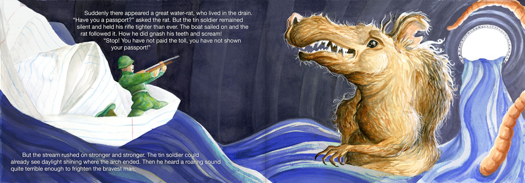
I decided the style of images I would use should reflect the child-like nature of fairy tales, and so I created vector outlines and imposed poorly done felt pen marks of various colours on top of them. These were the results.

I'm very happy with them because they reflect the often child-like nature of modern art whilst at the same time being quite delicate and quirky.


Friday 2 May 2014

COP - Theory Into Practice - Decisions

Size
Like specified in a previous post, a fairy tale book would need to fit into a childs hand, and so for that it needs to be fairly small. I have decided that A6 is the most appropriate size to use, as it's not small enough to make the layout cramped, but not big enough to leave loads of gaps due to not having much text.

Stock
Whilst I'm not sure exactly what stock I want to use, I know what requirements I'm looking for. I want to be white or very slightly off-white as I feel like the overall feel of the book should be positive and I think the cleaner the stock is, the more this will come through. I don't want my stock to be massively textured as I don't want the quality of the images to be compromised when printing due to the importance of images in fairy tale books. It also needs to be thick enough to be fairly strong but not too thick to the point where it won't fold very easily or will creep when it comes to binding.

Binding
Due to the elegant and dainty nature of what I want to produce, I think using thread to saddle-stitch bind the book would be most appropriate. If I use a pastel colour thread to do so this will add a feminine feel to the book which would reflect the nature of fairy tales.

Fonts
Initially I thought that it would be most appropriate to use a script font to get the feel of elegance, but I found that on a small scale script fonts tend to be quite illegible. I looked at some spreads from existing childrens books to see how they approached typographic decisions, and found a varied range of font styles used, as shown below.


I found that I liked the quirkiness and relaxed feel of the hand-written style of typeface in the bottom image, but I think that because my book will have an underlying message to it, I need something a little more regular and standard.

I also thought that the use of roman serif typefaces somewhat clashes with the idea of youth, and so this is something I wish to avoid.

Taking these factors into account, the font I will use is Futura, as it's sans serif, and the fact that the cap height is different to the ascender height and is quite a narrow typeface might give it the quirky and child-like feel I'm looking for whilst still being standard enough to not seem too immature.

Images
After looking at examples of childrens books to help inform my font choice, I found a style of illustration that will be really appropriate for me to use.


This style of illustration is really appropriate because it has a slightly messy feel to it which gives the impression that children could've done it. This also reflects some styles of fine art.

Wednesday 30 April 2014

Comparison Websites

I looked at a few comparison websites, most of them were serious ones, but I also looked at comparethemeerkat.com as well, because of how it has a relaxed, jokey tone to it which is what I want to achieve in what I produce. I looked at it because obviously it’s a spin off of an actual comparison website, and so I thought it’d be interesting to see how an actual comparison site would go about creating that sort of attitude. The most fun looking and engaging serious website I found was Trivago, which  I think works because of the bright colours, it’s simplicity and it’s positive tone. It doesn’t portray anything of the websites as any better or worse than the others though, which I find a bit odd.


Trivago's Home Page


Compare The Meerkat's Home Page
Comparing the above two to the two below, confused.com and uswitch, you notice how the use of pastel shades with white is less engaging. I also feel they have a more serious layout than the previous two, as there are a lot more options available made available to the use instantly, to the point where it seems a bit overwhelming. Whilst the Trivago layout is very much straight to the point, I do feel that it's a lot more casual and relaxed than the two below.


Confused.com's Home Page 


uSwitch's Home Page 


Tuesday 29 April 2014

Student Cook Books


When I looked at Student Cookbooks I found that there were two distinct styles of them. The first style is reflected in images above, with thin text and Marks and Spencer style photography. Personally I don’t think that this is massively different to any other cookbook, and doesn’t reflect the sort of happy-go-lucky approach most students have towards cooking, and it comes across as something more serious, maybe something a mother would use to make meals for her family. The second type is reflected in the images below. I think the bolder, more in-your-face style of them is more reflective of students attitudes towards cooking, and so this is the sort of style I need to use. 


Clearly both these books have a massively bright use of colour, and I'm not sure how I feel about that. It's probably necessary as I know from experience that most students take a lot of encouraging to do some proper actual cooking, and so having something bright that grabs your attention and induces a positive attitude is probably a good thing. I do think that they've gone a bit over the top though, particularly the one on the right. I say this because the 'For Dummies" book is part of a series, and so the bright yellow is necessary for their branding. The red used in the other book however, seems to be completely random, and the contrast it has with the orange text is quite poor, "Ultimate Student" stands out a lot more than "The" and "Cookbook".


Looking at this range of books now makes me wish I'd researched them more and earlier on in the project, as they have the exact tone of voice which I was trying to achieve in my booklet.

Monday 28 April 2014

Supermarket Branding

Morrisons is the largest supermarket chain in the UK, because of this, it very much has the image of being the peoples supermarket, at least in the North anyway. It’s bright yellow and green colour scheme gives of a happy vibe, and it’s TV adverts are generally quite light hearted and upbeat, more recently having Ant and Dec cast in them for humour.


Waitrose is the exact opposite of Morrisons in that it has an image of being expensive and upmarket. This is reflected in it’s branding which is mainly very clean and minimalist being white with little bits of green. which has connotations of health. Morrisons has a much more jolly attitude than Waitrose purely because of it’s branding. 


Budget supermarkets tend to have similar branding. LIDL and Aldi are both examples of these shops, and both use basic shapes and basic colours in their logos to reflect the basic service that they provide, The fact that one uses a bold gothic font whereas the other uses a slab serif font suggests that it is the shapes and colours used that can give you an idea of what sort of pricing a supermarket offers more so than the font.